
Vipps
Increasing Customer Loyalty Through In App Payments
Role
UX design Intern
Timeline
June-Aug 2022


Project overview
Vipps is Norway’s leading fintech company, originally launched by DNB (the country’s largest bank) in 2015. Today, it’s backed by over 130 banks and used by more than 4 million Norwegians. With over 90% market share, “to Vippse” has literally become a verb in the Norwegian language.
In June 2022, I had the opportunity to join Vipps as a UX design intern, and for eight weeks, I got to dive headfirst into the world of in-house product development. Coming from an agency background, this was a refreshing shift. At Vipps, user understanding wasn’t just part of the process, it was the foundation and a clear priority.
Our team was tasked with the challenge: How might we increase customer loyalty for merchants using the Vipps app?
My contribution
As part of a dedicated squad of interns, I collaborated with another UX designer, a service designer, seven developers, and a product owner. My contributions included conducting user research, creating wireframes and prototypes, and working closely with developers to ensure seamless design implementation. I also participated in usability testing, A/B testing, and continuous feedback loops with stakeholders to refine our designs and ensure alignment with user needs and business goals.
Reflections
At Vipps, I experienced a research-driven culture where making things user-friendly wasn't just a goal, but a shared mindset. It was exciting and inspiring to be part of a team that genuinely prioritised user needs. Coming from an agency background, I often saw research sidelined due to tight timelines, but at Vipps, I saw what’s possible when a cross-functional team is given the time and space to fully explore a problem space and ensure the right problem is being solved.
Framing the Problem
We kicked off with a design sprint to explore the world of stamp cards and the problem we wanted to solve. We were given a prompt, which we could take whichever way we felt necessary:
“It’s messy and cumbersome accumulating prepaid punch cards for all my different activities.”
We split into smaller sprint teams, each with a designer, and tackled the problem space from different angles. Over five focused days, we defined the challenge, interviewed users and subject matter experts, sketched out solutions, prototyped, and tested with real users.
At the end of the sprint, we had ideas, but also a fork in the road. Different teams had interpreted the challenge differently. Stamp cards? Bonus cards? Gift cards? Loyalty? Rewards?
We needed to zoom out before zooming in.


We spent the design sprint ideating and questioning everything - LOTS of post it’s were used…
Deciding which problem to solve
To realign, we stepped back and categorised user behavior around loyalty programs into three types:
Everyday activities: Think coffee, dog food, things people do on autopilot.
Luxury treats: Hairdresser, cinema, or a spa day.
“Should-do” activities: That gym you never quite make it to.
We analysed each of the types and soon decided that everyday activities would be the sweet spot: they’re repetitive, habit-driven, and great for both users and merchants. Their frequency creates real opportunities for loyalty systems to make a meaningful impact.
To sharpen our focus and align the team around a clear problem, we mapped an experience canvas outlining our hypothesis, key personas, stakeholders, value drivers, and the minimum viable experience needed to test our assumptions. This became our compass, helping us stay aligned as the project evolved.
Our hypothesis:
We believe we can increase transactions in the Vipps app by seamlessly integrating stamp cards into the purchase flow, making them a natural part of the user experience.
Diving into Design
Once the problem space was clear, we went deep into design.
We operated as a cross-functional team, working shoulder-to-shoulder with developers. Sitting together, we tested flows at each other’s desks, tweaked components in real time, and iterated rapidly. This close collaboration enabled us to design smarter and build faster.
We designed with two key audiences in mind:
The end user (on mobile): How to activate, use, and receive loyalty bonuses, without it feeling like extra work.
The merchant (on web): How to create, activate, and manage stamp cards, without needing new hardware or training.
Throughout the process, we conducted multiple user testing sessions, gathering feedback at every stage. These sessions were crucial, not only for validating our decisions, but also for challenging and refining them. One of the highlights included a visit to the head office of Kaffebrenneriet, a well-known Norwegian coffee chain, where we gained deeper insights into their needs. While the initial feedback on our concepts was positive, it was clear that further refinement was needed. Their key message to us: they wanted speed, simplicity, and no additional technology to install.


We had a lot of fun along the way, here I am showing off a prototype that brought our ideas to life.
While designing, we kept the storyboard up to ensure everyone stayed on the same page

A lot of time was spent perfecting the UI. Key changes were made base to ensure alignment with Vipps’ branding and existing design patterns. Pictured is the evolvement of the experience of 'receivening a stmap’ in the purchase flow. An integral part of the experienc

A major change based on feedback was the experience of using the stamp card.
We found that the initial idea of barcodes disrupted the purchase flow and excluded merchants without the right tech.
The solution
The final solution was a fully integrated loyalty experience, seamlessly built into the Vipps app. Users would automatically receive a ‘stamp’ every time they paid a participating merchant using the app. The stamps were collected in the background as part of the regular payment flow, making loyalty feel effortless.
On the merchant side, they could set up the loyalty program to fit their business: choose which products it applied to, define the reward (free or discounted product), and decide how many purchases it would take to get there, whether that was the 5th, 8th, or 10th visit.
This created a win-win-win: customers got a rewarding and low-effort experience, merchants saw increased return visits and gained insights through anonymised data, and Vipps drove more in-app transactions, one step closer to becoming the go-to digital wallet in Norway.
By the end of the 8-week internship, we delivered a fully functioning, market-validated solution, which was demoed and presented across the company. Our work made a tangible impact; both in-store payments and customer loyalty programs have since been introduced into Vipps' product offering. While the final implementations have evolved, the core idea of creating a frictionless and rewarding experience that connects users and merchants remains at the heart of the solution.


Key mobile screens
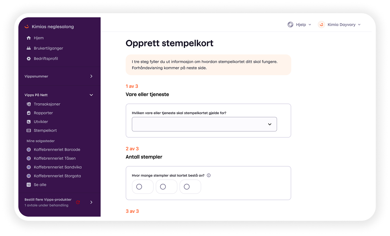
Key screens from the merchant experience, setting up and managing stamp cards
Merchant dashboard showing insight from stamp card usage across different entities.